Friday, May 21, 2010

Homework - Ms.Van Der Sanden

Media Forms:

What conventions of advertising are evident in this text?

The advert uses typical conventions of an advertisement which is evident within the trailer. Such as the very well known slogan ‘life is for sharing’ this slogan applies to many aspects of the ad, as people were evidently seen on their mobile phones sharing what they see with other people and also recording the performance as well as taking pictures of it so they can share it with others which can also be related to viral marketing as this will be uploaded on sites such as Facebook, YouTube, Twitter, Myspace etc.. for everyone to view and share their comments. This is also seen as UGC (user generated content) as people are able to post their opinions on what they think about it etc.

Diegetic music is being heard and songs which are well known are being played for example the mash potato song which will appeal to the older generation as this is music of their time and Pussycat dolls – Don’t cha which will be appealing for those of a younger age group, therefore the performance will relate to people of all ages and social groups and not one specific group as T-mobile product (phones, contracts etc) are also targeted at everyone. The ad uses shock tactics as everything seems normal at the start and all of a sudden music is blasting and people are dancing this is a shock tactic for audiences at the station and for those watching the ad, as it is very unexpected. It could be used as personal identification as Liverpool station is used

And is one of the largest and famous train stations which is used daily for most people, also the viewers of this ad would be able to personally identify with it as everyone participating in the ad are normal, regular people just like their viewers. The brand on the other hand is also a typical convention as the real purpose is to publicise T-mobile and for people to acknowledge it therefore they use the brand at the very end of the ad like other typical trailer for example the GHD ad.

Representation:

How is technology represented in this advertisement?

Technology is represented as being very accessible, easy to use, positive and user freindly as everyone is seen using a form of technology for example a mobile phone, notebook or camera of some sort. This is shown to the audience through a point of view shot and birds eye view shot to emphasise how popular technology has become overtime and it is now a necessity for everyone. Also, techn

Friday, March 26, 2010

Poster analysis


What codes and conventions does this advertisement use to connote the genre of the film?


This poster uses typical codes and conventions to connote the genre of the film. Alice in Wonderland is a cross between adventure, horror and fantasy. A reason for this is because the use of a high top key light as a backdrop makes the poster look very dull and mysterious which connotes the genre of horror, as this is typically used on most horror ads. The use of the colour black not only allows the image and text to stand out but also foreshadows something is amiss as it is a typical colour that posters use in order to give away the mood of the film. The centralised image of the main protagonist is also creates a sense of mysteriousness as the way in which she is presented with dull make up and a long dress gives the poster and the film a scary background. However on the other hand, the enlarged cup and succour connotes the story will be of a fantasy tale, as in reality succours and cups are not bigger than a human. This also helps the audience have insight to what the narrative may be about, as the unrealistic succour and cup suggests there will be other things in the film itself that will not have a sense of realism. In addition the font used for the text, adds to the codes and conventions of a horror that are being followed.


How are women represented in this ad?


Based on the centralised image, women are represented as being evil. The main protagonist is a girl therefore the poster connotes that the film will be female dominated. Stereotypically women would be sexually objectified to help promote their film. However this poster clearly sticks to the codes and conventions of following a fantasy horror. Her posture and pose establish she is the main protagonist as she is the focal point of this poster. She is presented as an evil character through the way she is dressed and her make-up, which suggests she plays the role of an evil character. The use of bright lighting on her, represents are as being very powerful and of great authority, which also helps present women as being very powerful.


Who is this poster targeted at and why?


The primary targeted audience are those who are over the age of 12 as the film is certified as a 12A. The poster connotes a sense of horror which those under the age of 12 may find very scary. Another reason is, this is an adaptation of the children’s story Alice In Wonderland, therefore this has been adapted to suit a higher audience. The demographics could be C2,D,E as these are people who are most likely to watch the film, however the psychographics are mainstreamers, aspirers and funseekers, as they are the group that like going out to places like the cinema. The secondary target audience may be those who are of a middle age i.e 40, as the story has been around for a long time therefore those in a older generation will have also hear of it, therefore this will also be targeted at them.

Textual Analysis Homework

What codes and conventions does this advertisement use to connote the genre of the film?

This poster uses typical codes and conventions to connote the genre of the film. Alice in Wonderland is a cross between adventure, horror and fantasy. A reason for this is because the use of a high top key light as a backdrop makes the poster look very dull and mysterious which connotes the genre of horror, as this is typically used on most horror ads. The use of the colour black not only allows the image and text to stand out but also foreshadows something is amiss as it is a typical colour that posters use in order to give away the mood of the film. The centralised image of the main protagonist is also creates a sense of mysteriousness as the way in which she is presented with dull make up and a long dress gives the poster and the film a scary background. However on the other hand, the enlarged cup and succour connotes the story will be of a fantasy tale, as in reality succours and cups are not bigger than a human. This also helps the audience have insight to what the narrative may be about, as the unrealistic succour and cup suggests there will be other things in the film itself that will not have a sense of realism. In addition the font used for the text, adds to the codes and conventions of a horror that are being followed.

How are women represented in this ad?

Based on the centralised image, women are represented as being evil. The main protagonist is a girl therefore the poster connotes that the film will be female dominated. Stereotypically women would be sexually objectified to help promote their film. However this poster clearly sticks to the codes and conventions of following a fantasy horror. Her posture and pose establish she is the main protagonist as she is the focal point of this poster. She is presented as an evil character through the way she is dressed and her make-up, which suggests she plays the role of an evil character. The use of bright lighting on her, represents are as being very powerful and of great authority, which also helps present women as being very powerful.

Thursday, March 18, 2010

Homework: Tesco magazine analysis

What typical codes and conventions of magazines does the front cover of Tesco Magazine use to appeal to its readers?

The Tesco Magazine uses typical codes and conventions on the front cover to help appeal to its readers in many ways. These include; having large masthead, using a slogan, the use of a longs hot and centralised image, the issue, secondary images, brand names, large text size, use of capital letters, puff and lastly a response in quotes. These are all stereotypically found on the front of magazines today which is why the Tesco magazine follows these specific codes and conventions to appeal to its readers. The large sized and bold masthead is used to catch the reader’s eye. Interestingly, the name of the magazine is “magazine” which injects the idea that this is a magazine and not a catalogue into the readers minds. This is a very clever technique used as most people would refer to the magazine as a catalogue as you are able to purchase things, however keeping the name of the magazine “magazine” creates awareness into the readers mind preventing them to think like this. The cover also uses a slogan “every little helps” this is placed in the far right hand corner, this is also a very well known slogan as it is broadcast on TV for the Tesco ad, therefore instantly the readers are able to know this magazine has relations with Tesco, even without the brand name of “Tesco” not being there. However as the brand is printed right above the large masthead, the readers are able to acknowledge the brand straight away. The cover also used secondary images to appeal to its readers. These are images of what you will find inside the magazine allowing the readers to have an insight to what the magazine will contain, therefore looking at this image of food, will instantly attract a wide range of audiences of both male and female above 16, as today everyone takes part in cooking and also because cooking is no longer specifically directed at women the way Tesco is also not aimed at a specific audience. Therefore this also links to the magazine by not making the magazine bias in any way. The use of capital letters and puffs also appeal to its readers as it allows everything on the page stand out, not only catching the readers eye, but allowing them to be aware of what they might find inside. In addition, the use of quotes ‘Losing weight gave me so much confidence’ on the cover page allows the readers to interact with what is written as they may agree or disagree with what is said, this is another aspect which helps appeal to its readers as it allows the magazine to interact with the readers.

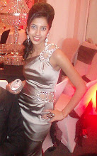
On the basis of the cover lines and images on this front cover, how are women represented?

There is a long shot of a middle aged woman centralised on the page. She is presented as a very sophisticated, glamorous and an ideal woman as a result of what she is wearing. She is wearing smart clothes therefore does not typically represent her as a housewife or homemaker which can be used as a personal identification for some women. However, the way in which she has posed also suggests that she is very independent and relaxed. This represents woman as of what they are today as now the majority of woman are working and focusing on their career. She is represented as a follower as it mentions things about weight ‘Losing weight gave me so much confidence’ which can be seen as a typical thing for a woman to say, yet it also shows she takes pride in her appearance through her posture, a get-up.
On the basis of this front cover and other general knowledge, what primary and secondary target audience would take home this magazine? Explain.

Primary audience would be females aged 23-55 as a result of the image used and quotations regarding losing weight. This is because this topic mostly applies to females more in comparison to men. The audience would be those who shop at Tesco’s more along the lines of C2,D and E. however, the secondary audience are men as is says ‘Boys’ toys you’ll love’ this makes it clear that there are things inside the magazine that would be targeted at men for example ‘gadgets’ etc. this shows that this magazine caters for the needs of everyone, all genders and of all ages. Therefore it is difficult to conclude to a specific audience type. Yet this is most convenient for those who are regulars at Tesco’s as the issues of Tesco magazines are not so frequent.
Explore ways how Tesco could make a profit from this magazine when it is available for free.

Firstly Tesco is a British International grocery and general merchandising retail chain which means there is more public awareness for Tesco’s as it cater for a range of needs for example, food clothing, electrics, educational, stationary, entertainment etc. This increases the number of people shopping at Tesco and by doing this, earns enormous amounts of profits. Tesco also earn profits by selling and giving away small company and market share with profits exceeding £3billion, and the third largest global retailer based on revenue. They use the profits to publish these magazines. Giving these away for free have many advantages and make Tesco a profit as people are able to take them away and order things from it, which means it makes more business for Tesco. There are six formats; Extra, Superstores, Express, Home Plus, Metro and One Stop. As Tesco are also involved in other consumer areas such as fuel, internet, banking and garden this attracts more people and therefore with every magazine given away for free, Tesco earn back their money as it attracts more people and also people have more knowledge on exactly what they can buy with the use of the magazine.

Monday, March 1, 2010

Homework - Ms.Van Der Sanden

Question 1)

The trailer uses many techniques to persuade its targeted audience to see the film. It uses the names of famous/well known actors and directors, for example Lauren Graham and Alexes Bledel, in order for people to watch the programme, as it makes the audience refer back to previous shows or films they have starred in for example Lauren Graham who starred in ‘Bad Santa’, and episodes of ‘Law and Order’, which automatically attracts their fan based audiences to watch the Gilmore girls. The narrative is very clear through the opening sequence of the show as they use cross-cutting scenes, where they pick out the best bits that hook its audience. The narrative could also persuade an audience as it could be used as a personal identification for those who lack a strong male head figure in the family, as it is shown the programme is focused on the mother and daughter relationship as most scenes and shots include them, whereas there is not much shots with the father. Also, those who are as close to their mothers will also be able to relate to the narrative also as a source of personal identification as it may stand as a representation to their own personal lives. The trailer uses non-diegetic sound of ‘Where you lead’ by Carol King, to suit the dramatic genre of the film. The instruments used in the music helps connote the relationship between the protagonists, an example of this is, the lyrics connote problems both mother and daughter face, however the more upbeat instruments connote the good times they both share. The use of short and fasts shots help the trailer flow and narrative develop giving the audience an insight to what the programme is all about however it uses an enigma code, which is not presented in the trailer. This is because the audience are left to wonder what a specific show will be about, whether it will be joyous or whether it will include some dramatic problems. The audience are unable to tell, as both are portrayed in the genre. The scene where the daughter puts her head on her mother’s shoulder helps suggest that they face problems however she is comforted by her mother and sticking together they will make it through. This allows the audience to see the emotional and intimate relationship between the two, not only through mother and daughter but also as best friends.

Question 2)

The narrative portrays the two female protagonists are from a middle class background. This is shown in the trailer as they lead a simple and fairly normal lifestyle. In the opening sequence they are seen in a local cafe and their rooms do not look so lavishing and posh, which connotes they are from a middle class social class. However in contrast, there is also a scene which shows their grandparents are wealthy shown through their surroundings and sense of dressing, stereotypically if a women wears pearls, it suggests they are well off, which in this case, her grandmother wears pearl bracelets and necklaces, which clearly connotes their higher social class in comparison to their daughter. A man is also seen sitting and smoking a cigar which also stereotypically comes across as a posh thing to do, as cigars are fairly expensive in comparison to normal packets of cigarettes. A prime example which stands as a representation of their social class within the narrative is right at the end, where both mother and daughter are seen eating at a local restaurant which is not posh and elegant but small and cosy, again suggesting they belong to a middle class social class.

Question 3)

Through the opening sequence it is clear the show is targeted at mainstreamers and aspirers, as the narrative appeals to them the most, where the two main leading roles are of those who follow a simple lifestyle, similar to those in these audience groups. As the show is aired during day time hours, it suggests it is targeted at teens from 16 onwards, this may be because the narrative shows the life of a teen therefore will also appeal to them more, however those above the age of 16 would also be attracted as it shows Lauren Graham play the role of a mother and a best friend and as she is of a much older age, she will also attract those of a similar age around 24ish. The physiographic will be of C1, C2, D and E as the show is broadcast on e4 therefore the audience must have sky in order to view the show.

Thursday, January 28, 2010

Homework - Ms. Van Der Sanden

Trailer analysis

http://www.youtube.com/watch?v=rLlpabVRnyc

I have chosen to analyse the trailer of the film ‘Brothers’.

There are many techniques used within the trailer which hooks its audience into watching the film. The use of a lot of cuts between each scene keeps the audiences eyes fixated onto the trailer as it then makes the trailer more interesting. The music also plays a role as it is calm and emotional at the beginning which connotes the death of someone, however then turns joyous which connotes happiness, yet on the other hand, towards the end of the trailer the music turns slow which helps bring about tension and enabling the audience to foreshadow that something bad is going to take place. The narrative is very clear and this helps attract the audience as the trailer is not complex and hard to understand, the trailer itself gives away the genres linked with the film i.e Romance where the couple kiss, Action – for when the two men end up in a conflict etc… In addition, the trailer is aimed at those who are over the age of 15. This is clear as the film contains violence, bad language and sexual content which would be inappropriate for those who are under 15 years of age. The trailer is also aimed at those over 15 as it also contains sexual content and violent behaviour. The trailer is not bias at all, as it shows both gender roles within the film, yet women are portrayed typically as someone’s wife, girlfriend, mother and are sexually objectified, however in this trailer the women is his wife and plays an equal role within the trailer, as she is in most the scenes. Also, men are stereotypically the protagonist as they always end up with the leading role, which is clearly shown in the trailer as every scene shown involves a man.

Wednesday, December 30, 2009

Christmas H.W (Ms.Van Der Sanden)

The ‘Vogue’ magazine shown above is clearly targeted at women. This is demonstrated with the use of shocking pink on the bold and large font sized masthead, cover line and the leader of the magazine in which this case is ‘the dynamic world of Victoria Beckham’ which also connotes its targeted audience as the magazine then gains a feminine look. The centralized image of Victoria Beckham in a medium close up, not only connotes the magazine is aimed at a specific gender but also helps attract its target audience, as women clearly would want to know more about Victoria Beckham on how and what she uses to make herself look attractive. The audience demographics are of a variety as the magazine appeals to, A, B, C1 and C2. This is because in today’s date all women are out to look good whether it is regarding fashion or make up, which then results the magazine having a widespread audience, regardless their field of employment. However, the price of the magazine which is £3, may be to high for those that fall into the demographics of D and E, as they may find this magazine too expensive. In addition, the use of Victoria Beckham’s image on the cover may also affect those that fit into the demographics of D and E, as they may feel the magazine does not fit into their simple life style and culture as the magazine stereotypically comes across as too many expensive accessories make up, fashion and glamour, stereotyping its audience as those who are financially well off. On the other hand, the obvious audience types this magazine relates to are Free spirits and Aspirers, as both types like to keep up with the latest trends and show concern regarding their image and appearance. The magazine also uses a slogan ‘Vogue, the thrill of see-through chick’, which connotes its target audience of women, however it also foreshadows what should be expected inside the magazine, for instance, the slogan may be interpreted in many ways such as, ‘see-through chick’ hinting out that some part of the magazine will focus on the ‘see-through’ appearance of ‘chicks’. The use of a retorical question on the far bottom left also attracts the readers audience, as it makes you stop what you are doing and think about the questioned posed. The fact that Victoria Beckham’s name is in big, bright, bold, and in capitals, connotes that the leading story is about Victoria Beckham and the main selling point of this magazine.


The ‘Play Station’ magazine is typically aimed at a male target audience. This is shown through the use of strong and dominant colors such as yellow and black throughout the page, for example, on the masthead, strapline, cover lines, headline, kicker, caption and web address, which helps the magazine as it then gives it a very masculine look. The font used on the magazine looks computerized and very robotic, which connotes the magazine will be regarding a form of technology, which in this case is a plays station console. The centralized image used is of a car as an extreme long shot, which clearly foreshadows what you will find and should expect in the magazine. The image also helps appeal to its target audience as, cars are something every man have an interest for. The use of such bold and eye catching colors, complement one another very well, giving it a hard and typically strong look, which will help appeal and attract its audience. The demographics of this magazine are A, B, C1 and C2. The reason for this is because you would have to own a play station in order to purchase the magazine, as it contains cheats to the games and more information on different games, this however limits its audience, as not every man would own a play station. The demographics does not always depend on the price of the magazine as in this case, those who are fit into the D and E demographics may not be able to own a play station therefore see no reason for buying this magazine. The psychographics of this magazine on the other hand are Free spirits and Aspirers, as both types like to keep up with the latest trends, in which this case is the latest technology or game consoles. With doing so they would fit in with the rest, therefore they choose to keep up with technology. By keeping up with technology, they would have to keep up with latest issues of the play station magazine as it helps them with there games, which is one of the main reasons for why this magazine would have a very high selling point.